5 In-App Announcement Mistakes That Train Users to Ignore You

In-app announcements should be one of the most effective ways to communicate with your users. They show up right where people are already working: no inbox competition, no spam filters, no hoping someone visits your blog.
And yet most users have learned to dismiss them without reading, because most teams use the format badly.
Here are five mistakes that train your users to ignore every announcement you send, and how to fix them.
Mistake 1: Announcing Everything
When every minor update, bug fix, and backend improvement gets an in-app announcement, your users learn that your announcements aren't worth reading. It's the boy who cried wolf, except with product updates.
Not every change deserves a notification. A small UI tweak doesn't need an announcement. A performance improvement that users won't directly notice doesn't need one either. Save your announcements for changes that genuinely affect how your users work.
The fix: Set a threshold. If a change doesn't require the user to do anything differently or doesn't unlock something they've been asking for, skip the announcement. A well-placed line in your changelog is enough for minor updates.
Mistake 2: Writing a Wall of Text
Your users opened your product to do their job, not to read a press release. When an announcement pops up with four paragraphs, a bulleted list, and a "learn more" link, most people will close it immediately.
You have about two seconds of attention.
The fix: Keep announcements to 2-3 sentences max. Lead with what changed and why it matters to the user. If there's more detail to share, link out to a blog post or a help article customers can find instead of cramming it into the announcement itself.
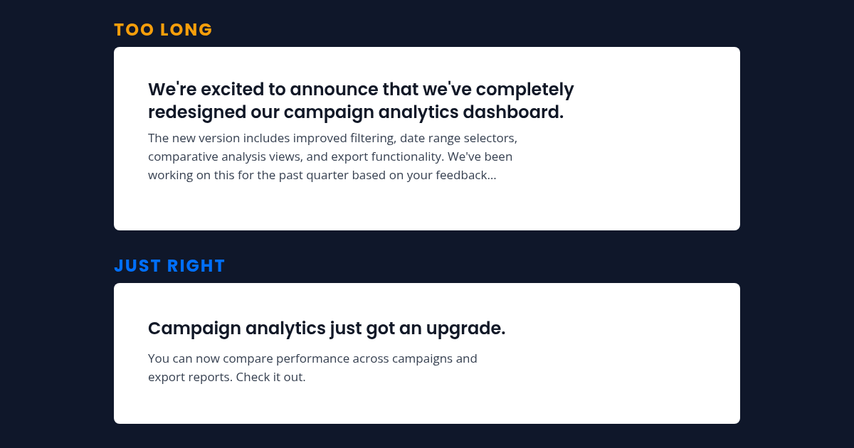
Here's the difference:
- Too long: "We're excited to announce that we've completely redesigned our campaign analytics dashboard. The new version includes improved filtering, date range selectors, comparative analysis views, and export functionality. We've been working on this for the past quarter based on your feedback..."
- Just right: "Campaign analytics just got an upgrade. You can now compare performance across campaigns and export reports. Check it out."
Mistake 3: No Targeting
Sending every announcement to every user is the fastest way to make your announcements irrelevant. A feature update for enterprise admins shouldn't appear for free-tier individual users. A change to your mobile app isn't relevant to someone who only uses the web version.
When users repeatedly see announcements that have nothing to do with them, they learn to close without reading. It takes surprisingly few irrelevant announcements to build this habit.
The fix: Segment your announcements by user type, plan level, or behavior. An announcement about an advanced reporting feature should only go to users who use reporting. An announcement about a pricing change should only go to users on the affected plans.
The more targeted your announcements, the higher the signal-to-noise ratio, and the more likely users are to read them.
Mistake 4: Bad Timing
Showing an announcement the moment a user logs in, before they've even oriented themselves, is a recipe for an instant dismiss. The same goes for interrupting a user in the middle of a workflow. If someone is halfway through composing an email campaign, they don't want to learn about your new help center features.
The fix: Time your announcements for natural pauses in the workflow. The best moment is when a user lands on a page where the change is visible, or right after they finish a task.
The best announcements feel like context, not interruption. If a user navigates to the analytics page and sees an announcement about a new analytics feature, that's helpful. If the same announcement pops up while they're in the middle of a live chat, it's noise.
Mistake 5: No Way to Dismiss (or Dismissing Too Easily)
Two extremes, both bad. Some announcements have no clear close button. The user has to click "Got it" or "Learn more" to make it go away, which feels coercive. Others disappear on their own after a few seconds, before the user had a chance to read them.
Both approaches erode trust. If users feel forced to interact with your announcement, they'll resent it. If the announcement vanishes before they can act on it, they'll feel like they missed something.
The fix: Always include a clear dismiss option, an X button or a simple "Dismiss" link. Don't force engagement. But also don't auto-dismiss. Let the user control when the announcement goes away. If they're interested, they'll read it. If they're not, they'll close it. Either way, they're in control.
What All Five Mistakes Have in Common
Underneath, they're the same habit: teams treat announcements as a broadcast channel. They work far better as a communication tool. A broadcast goes out to everyone at full volume and gets tuned out. Communication is targeted and timed, and it respects that the person on the other end is busy.
Every announcement you send either builds or erodes your users' trust in the format. Send ten irrelevant ones, and the eleventh (the one that matters) gets closed without a glance.
The goal is fewer announcements, better targeted, and sent only to the people who need them.
Announcements also land better when they share context with the rest of your support stack, so whoever writes them sees the same customer history as the people answering chats and help requests. That shared context only works when chat, help center, and announcements live on one connected platform instead of separate tools.
Pavior's Announce feature lets you target announcements by audience segment and keep your messaging concise and relevant, so the few announcements you send are the ones worth reading.